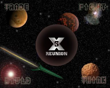
It's OK I guess, well done for making one, but I think that it needs some more work. In particular I don't like the fact that the centre of the shot is blocked out.
My idea of a wallpaper is some beautiful shot with the Logos and stuff tucked in the corner. The X3 logo is not beautiful.
But that's just IMHO, congratulations on actually bothering, not many people do.
I am using the Teladi Falcon Screenshot of the Day when it is against a bright blue planet and dark blue space.
1) divide the screen into three equal parts with imaginary vertical lines. this is called "The Rule of 3's". You will want to place your most important objects on one or both of those lines. So, for instance, instead of putting the text in the corners where they get lost, line them up on the right-hand line one on top of the other so that you've left space on the left for icons, the left side being where most people keep their icons. Also, the rule of 3 explains why your central logo is bothersome. Putting stuff in the exact center of the composition lacks sophistication, and should normally be avoided. Look at your game box. The X is not in the very middle of the box.
2) Use "negative space" as it's own object. Negative space is compositional area where there is little to no visual information. You can use negative space to cause the viewer's eye to jump to the part of the composition that's most important. Again, your negative space is mostly symmetrical, and leads away from both the text and the main logo. The nebula behind the planet in the upper left creates a strange negative space that is drawing the eye into the corner of yor image. Again, look at the game box. Where is the negative space? How does it add to the composition of the main art? (Ignore the company logos that might be superimposed at the bottom of your box, as publishers usually see negative space as a keen place to put their obligatory text.)
3) Have your main visual elements point to the main focus of your composition. Your rocket is pointing away, and it's jet trail points to nothing. Either point the rocket at the main logo, or curve it's jet stream three-dimensionally so that it points at the logo, as if the rocket has travelled in an arc. What elements on the game box point to the main focus of the composition?
4) Speaking of 3-dimensionality, you should always strive to put something in the FOREGROUND (close to the viewer), something in the BACKGROUND (very far way from the viewer), and something in the MID-GROUND (mid-range distance). Background stuff creates a sense of scale, which is why the stations look so cool next to the giant planets in the game, plus it helps to set the perspective. Midground stuff usually sets the focus (eyeline and perspective vanishing points), so things in the midground have to be placed very carefully. Stuff in the foreground usually is there to add visual interest. Maximum visual interest is achieved when a bit of the foreground actually occludes (blocks the view of) a bit of the midground. On the game box: what's in the foreground? A Dyson ring. Does it block a bit of the mid-ground? Why, yes it does. What's in the midground? A burning planet. It's set a little high, so that the vanishing point is at an imagined eye-level. That helps decide how to create the perspective for the "solid" looking shape surrounding the 3. What's in the backround? Space, stars, and the other Dyson ring bit. Makes the planet look more like a planet, right? Big planets have rings around them, and putting the rings in makes them look big, even if you draw the planet the size of a dime.
These four tips are your basic plug-and-play rules. If you don't understand them, or don't use them consistently, you will increase your chance of getting a bad composition. People will still be polite to you when they see your stuff, but you won't learn what they really think. You can, of course, break or bend these rules, but generally they are so useful, and non-artists are so unaware of them, that you usually don't have to bother, unless you're in one of those phases where you just have to break the rules at any cost.


